Emi
Revitalizing the brand identity of a medical care company that is consolidated in the region.
Situation
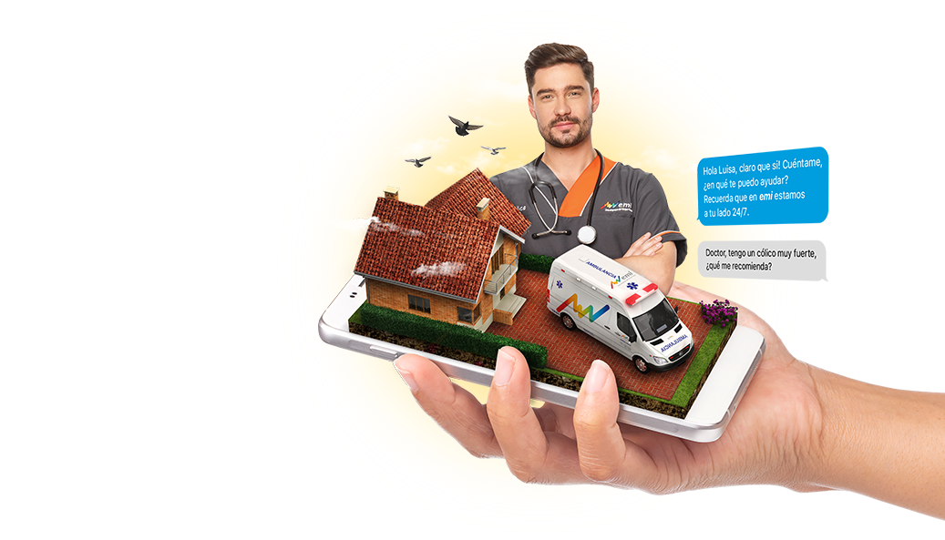
Emi is the largest home health care company in Latin America. It grew through acquisitions of local companies that provide emergency services in several countries. Despite being leaders and pioneers in the market, the general public did not know the services provided by the company. In addition, due to the number of acquisitions, Emi projected a fragmented image in the market, since there was no uniqueness in the use of the logo in the different markets, nor did they have a clear nomenclature system for their services.
Solution
Marqas defined a positioning strategy based on the purpose of promoting a more active life, which was reflected in the slogan: “live at your own pace”. We recommended a unitary brand architecture model and a new nomenclature and visual systems. As part of the project, Marqas redesigned the logo, emphasizing the symbol of the ‘line of life’, to evoke energy and vitality. To reinforce the idea of neatness and professionalism, we preserved areas of wide color with a predominance of white. The new naming system organized communications by customer segments and clarified access to the services and plans that Emi offered. The new identity was applied in ambulances, uniforms, brochures and signage. Today it is perceived as a more accessible health services company, with a clean and modern image that reflects seriousness, agility and closeness. Its brand strength allowed it to consolidate its leadership in the region and inhibit the entry of potential competitors.


Related projects


See other projects
- Acesco
- ACP
- AGG
- Alianza
- Amarilo
- Antillana
- Aqura
- Argos
- Artisan
- Astron
- Axede
- Banco de Occidente
- Banco W
- Bancolombia
- BMC
- Breadco
- Brilla
- Casa Luker
- Casa Q
- CDMX
- Celsia
- CNCH
- Colcafé
- Corona
- Credivalores
- Dagusto
- Delecta
- Dicorp
- Doria
- Ecopetrol
- Emi
- Encantado
- Equidad
- Esencial
- Estelar
- ETB
- Exela
- Ezenza
- Fájate
- Fanalca
- Farinter
- Ficohsa
- Fundación Televisa
- Gobo
- Grival
- Grupo Argos
- Grupo Éxito
- Grupo Nutresa
- Grupo Orbis
- Grupo Progreso
- Herragro
- IziPay
- Juanfe
- La Cabaña
- La Joya
- La Santé
- Luker
- Mansfield
- Manuelita
- Maxo
- Meals
- MinDefensa
- Noel
- Odinsa
- Olv
- Oma
- Orux
- Ospinas
- Pintuco
- Piropo
- Porvenir
- Pronaca
- Proscenio
- Protección
- Qiip
- Ramo
- Sabi
- Sanofi
- Sol
- Solla
- Sonría
- Star
- Sumicol
- Sura
- Sushi Itto
- Tania
- TCC
- Team
- Tecnología
- Termoemcali
- Tuya
- Va y Ven
- Valórem
- Vanti
- Vardí
- Vid
- Welden
- Zenu
CLIENTS
APPROACH
PEOPLE
ABOUT
CONTACT
@2019 MARQAS INC. All rights reserved. Terms of use. Privacy policy.
