
CDMX
Creating an iconic brand for ones of the largest cities in the world.
Situation
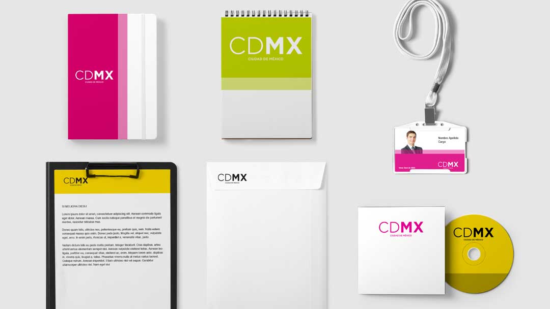
The Mexico City government decided to change Mexico City’s brand identity after the city’s name was changed from Distrito Federal to Ciudad de México. All the brands that had been created for the city were not memorable and were designed based on complicated baroque shapes, with a variety of colors that made their application difficult. Marqas was hired to design the City’s new brand identity.
Solution
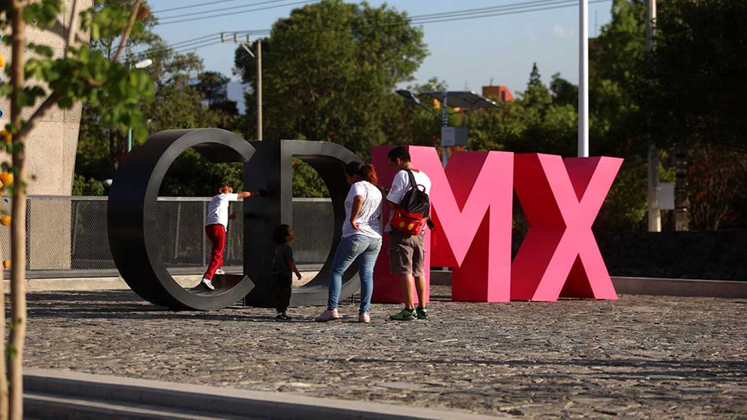
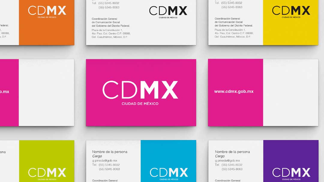
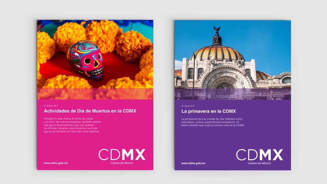
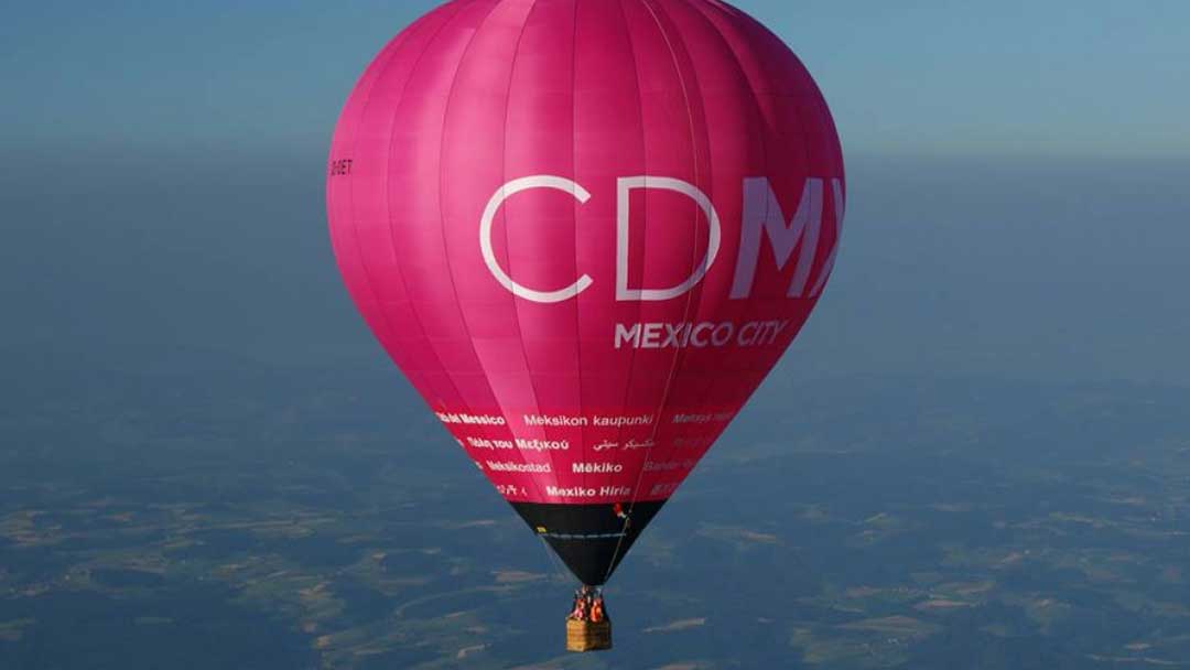
As a first strategic definition, Marqas proposed the use of an acronym —CDMX—, simplifying the City’s name. The name Mexico City was difficult to read and to apply in small formats. We designed a simple and contemporary typographic logo and a visual system a color palette that refers to the dynamism, variety and diversity that exists in Mexico City. We created a striking, emblematic and current brand that distinguishes the City. Today it is implemented throughout many brand applications including vehicles, signage, uniforms and printed materials. Since its launch in 2014, the CDMX brand has been adopted by the inhabitants of Mexico City as an icon of pride and belonging. It has positioned itself in such a way that the national and international media refer to the city simply as “the CDMX”. The campaigns that have been implemented in this administration have contributed to the consolidation and institutionalization of the city brand.
Related projects
See other projects
- Acesco
- ACP
- AGG
- Alianza
- Amarilo
- Antillana
- Aqura
- Argos
- Artisan
- Astron
- Axede
- Banco de Occidente
- Banco W
- Bancolombia
- BMC
- Breadco
- Brilla
- Casa Luker
- Casa Q
- CDMX
- Celsia
- CNCH
- Colcafé
- Corona
- Credivalores
- Dagusto
- Delecta
- Dicorp
- Doria
- Ecopetrol
- Emi
- Encantado
- Equidad
- Esencial
- Estelar
- ETB
- Exela
- Ezenza
- Fájate
- Fanalca
- Farinter
- Ficohsa
- Fundación Televisa
- Gobo
- Grival
- Grupo Argos
- Grupo Éxito
- Grupo Nutresa
- Grupo Orbis
- Grupo Progreso
- Herragro
- IziPay
- Juanfe
- La Cabaña
- La Joya
- La Santé
- Luker
- Mansfield
- Manuelita
- Maxo
- Meals
- MinDefensa
- Noel
- Odinsa
- Olv
- Oma
- Orux
- Ospinas
- Pintuco
- Piropo
- Porvenir
- Pronaca
- Proscenio
- Protección
- Qiip
- Ramo
- Sabi
- Sanofi
- Sol
- Solla
- Sonría
- Star
- Sumicol
- Sura
- Sushi Itto
- Tania
- TCC
- Team
- Tecnología
- Termoemcali
- Tuya
- Va y Ven
- Valórem
- Vanti
- Vardí
- Vid
- Welden
- Zenu
CLIENTS
APPROACH
PEOPLE
ABOUT
CONTACT
@2019 MARQAS INC. All rights reserved. Terms of use. Privacy policy.