Argos
Transforming a cement company formed from the merger of eight local companies.
Situation
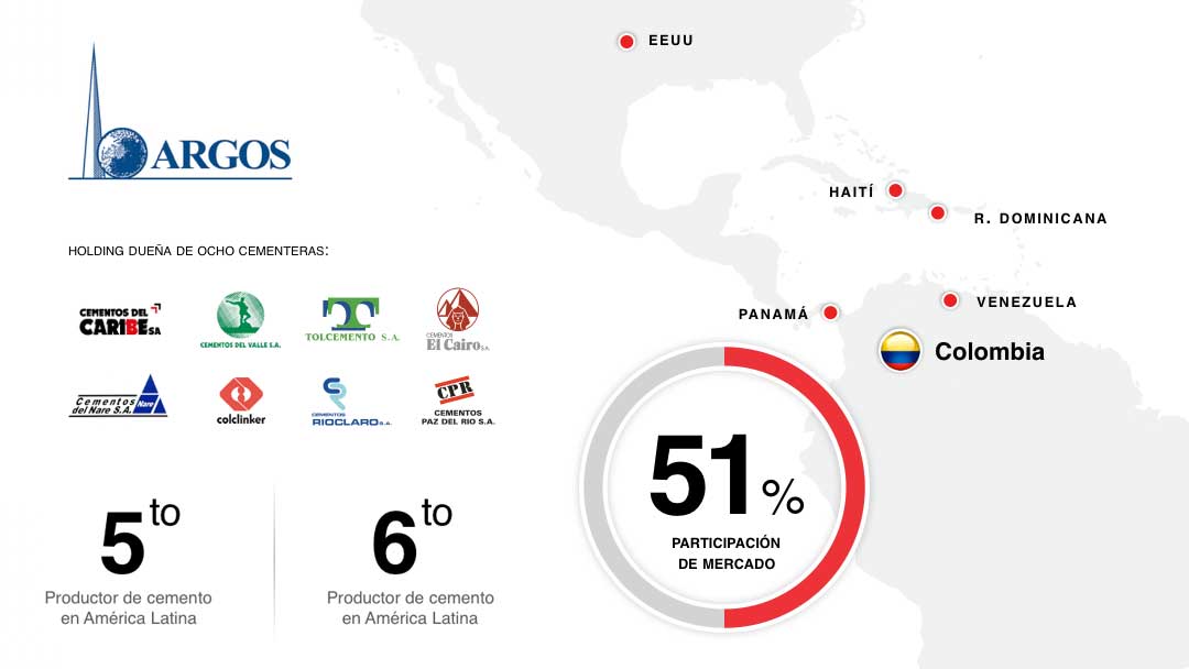
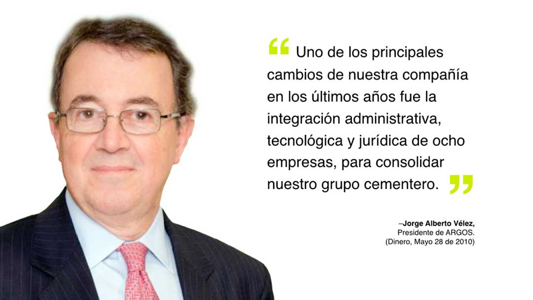
Argos was a holding company that owned a group of cement companies that had more than 50% of market share and operations in several countries. It was perceived as very low profile company and projected a fragmented brand image. The lack of differentiation in a competitive environment and the commoditization of cement hindered its regional expansion. Argos undertook an operational restructuring: it merged all local cement companies and created a more efficient integrated company.
Solution
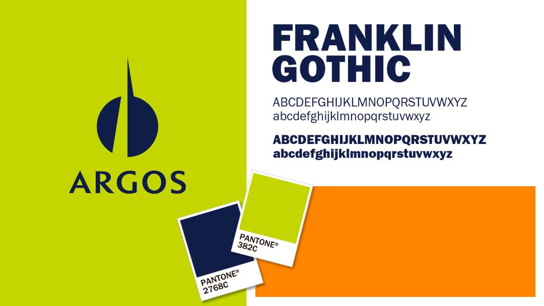
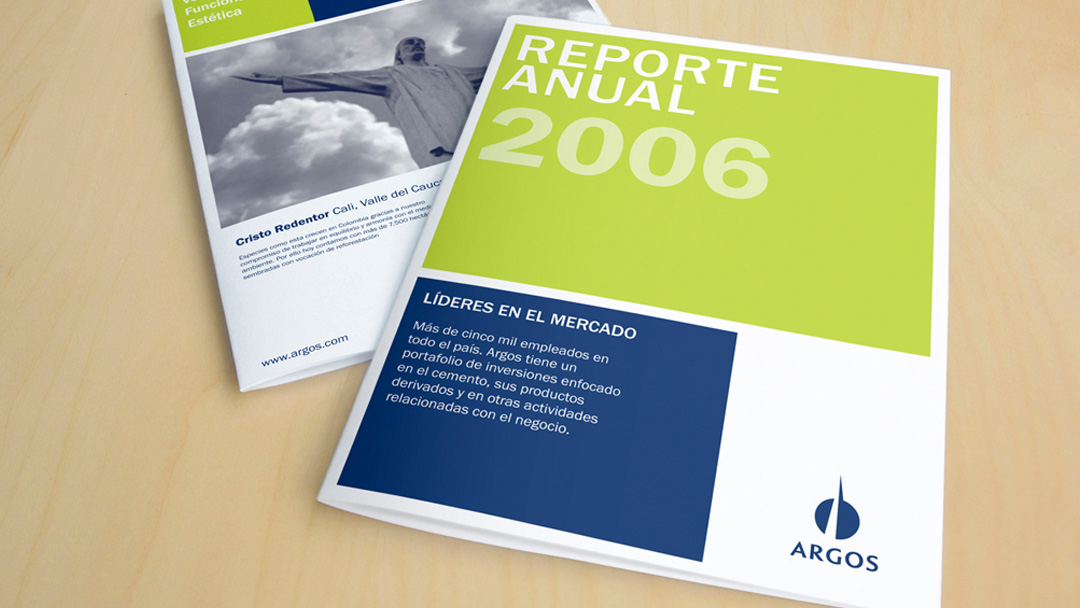
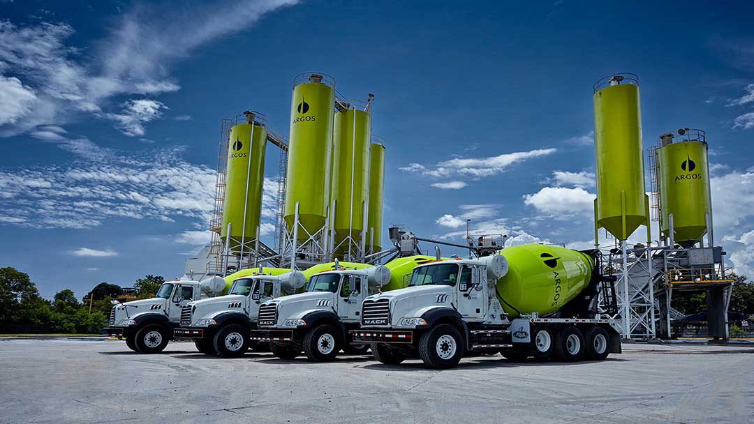
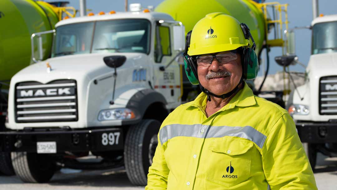
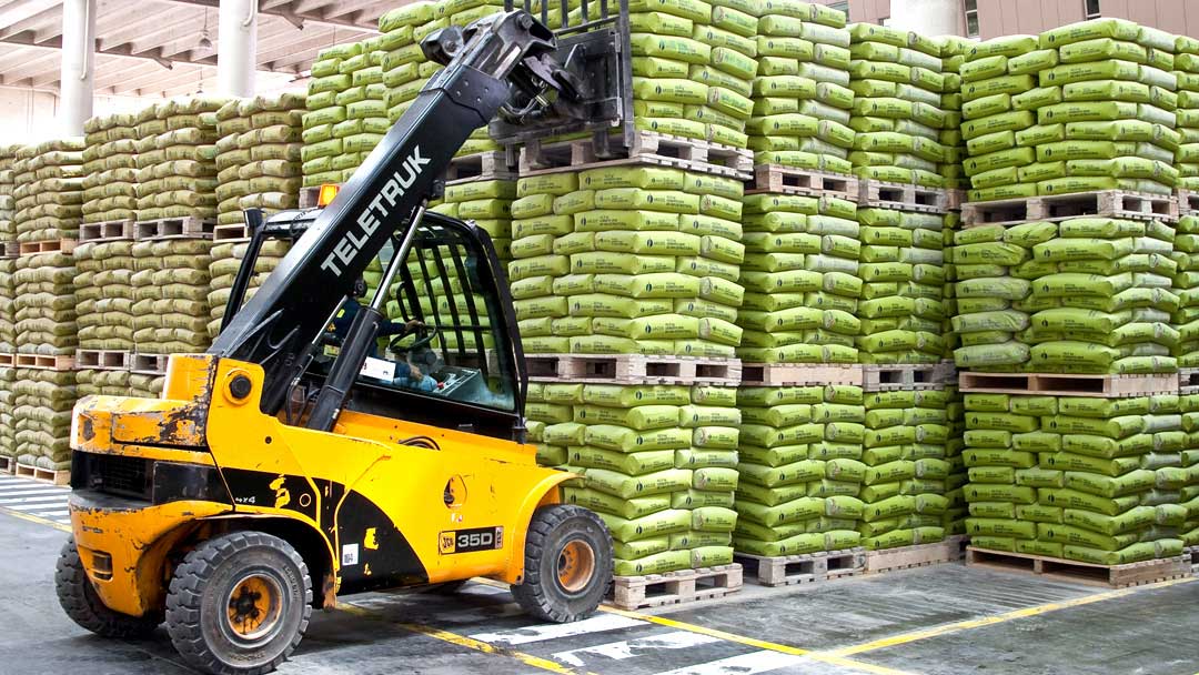
Marqas worked with Argos to reposition the brand in the market, as a more cohesive and customer-oriented company. It enhanced the visibility of the holding brand and eliminated certain cement, concrete and distribution companies’ brands. We designed a logo that is an evolution of the original logo, a visual system inspired in a color palette that uses green to highlight the concepts of growth, renewal and the environment, intrinsic values of the company. This is how the company acquired a distinctive color in the industry, present in its trucks, packaging and silos.
Argos reinvented itself above the competition and after the launch its market share increased by 1.5%. Argos cemented a strong and consistent image, which contributes to the expansion of its operations in the region and to the worldwide projection.
Related projects

See other projects
- Acesco
- ACP
- AGG
- Alianza
- Amarilo
- Antillana
- Aqura
- Argos
- Artisan
- Astron
- Axede
- Banco de Occidente
- Banco W
- Bancolombia
- BMC
- Breadco
- Brilla
- Casa Luker
- Casa Q
- CDMX
- Celsia
- CNCH
- Colcafé
- Corona
- Credivalores
- Dagusto
- Delecta
- Dicorp
- Doria
- Ecopetrol
- Emi
- Encantado
- Equidad
- Esencial
- Estelar
- ETB
- Exela
- Ezenza
- Fájate
- Fanalca
- Farinter
- Ficohsa
- Fundación Televisa
- Gobo
- Grival
- Grupo Argos
- Grupo Éxito
- Grupo Nutresa
- Grupo Orbis
- Grupo Progreso
- Herragro
- IziPay
- Juanfe
- La Cabaña
- La Joya
- La Santé
- Luker
- Mansfield
- Manuelita
- Maxo
- Meals
- MinDefensa
- Noel
- Odinsa
- Olv
- Oma
- Orux
- Ospinas
- Pintuco
- Piropo
- Porvenir
- Pronaca
- Proscenio
- Protección
- Qiip
- Ramo
- Sabi
- Sanofi
- Sol
- Solla
- Sonría
- Star
- Sumicol
- Sura
- Sushi Itto
- Tania
- TCC
- Team
- Tecnología
- Termoemcali
- Tuya
- Va y Ven
- Valórem
- Vanti
- Vardí
- Vid
- Welden
- Zenu
CLIENTS
APPROACH
PEOPLE
ABOUT
CONTACT
@2019 MARQAS INC. All rights reserved. Terms of use. Privacy policy.

