
Protección
Creating a differentiated logo, for a subsidiary brand, within the system of a financial group.
Situation
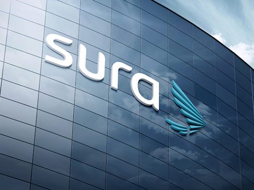
When Sura restructured its brand architecture, it was necessary to create a system that considered all the subsidiaries and companies of the Group in the different countries of the region. Due to legal restrictions, several of these company brands could not associate directly with Sura. That was the case of Protección.
Solution
Faced with the challenge of creating a trademark system where the brand Protección and others could not be associated with the Sura brand, Marqas created a distinctive style for the treatment of these logos. The objective was that they could be part of the same family, but at the same time be different from each other. For Protection, AFP Crecer, AFP Capital and AFP Integra, typographic logos were designed with the main blue color of Sura, but without its characteristic symbol, the condor. Thus Protección preserves its name and has a graphic identity similar to the Group’s identity but at the same time distinctive in its environment.
Related projects
See other projects
- Acesco
- ACP
- AGG
- Alianza
- Amarilo
- Antillana
- Aqura
- Argos
- Artisan
- Astron
- Axede
- Banco de Occidente
- Banco W
- Bancolombia
- BMC
- Breadco
- Brilla
- Casa Luker
- Casa Q
- CDMX
- Celsia
- CNCH
- Colcafé
- Corona
- Credivalores
- Dagusto
- Delecta
- Dicorp
- Doria
- Ecopetrol
- Emi
- Encantado
- Equidad
- Esencial
- Estelar
- ETB
- Exela
- Ezenza
- Fájate
- Fanalca
- Farinter
- Ficohsa
- Fundación Televisa
- Gobo
- Grival
- Grupo Argos
- Grupo Éxito
- Grupo Nutresa
- Grupo Orbis
- Grupo Progreso
- Herragro
- IziPay
- Juanfe
- La Cabaña
- La Joya
- La Santé
- Luker
- Mansfield
- Manuelita
- Maxo
- Meals
- MinDefensa
- Noel
- Odinsa
- Olv
- Oma
- Orux
- Ospinas
- Pintuco
- Piropo
- Porvenir
- Pronaca
- Proscenio
- Protección
- Qiip
- Ramo
- Sabi
- Sanofi
- Sol
- Solla
- Sonría
- Star
- Sumicol
- Sura
- Sushi Itto
- Tania
- TCC
- Team
- Tecnología
- Termoemcali
- Tuya
- Va y Ven
- Valórem
- Vanti
- Vardí
- Vid
- Welden
- Zenu
CLIENTS
APPROACH
PEOPLE
ABOUT
CONTACT
@2019 MARQAS INC. All rights reserved. Terms of use. Privacy policy.