
Sushi itto
Repositioning of the leading brand in Japanese-Mexican fusion fast food.
Situation
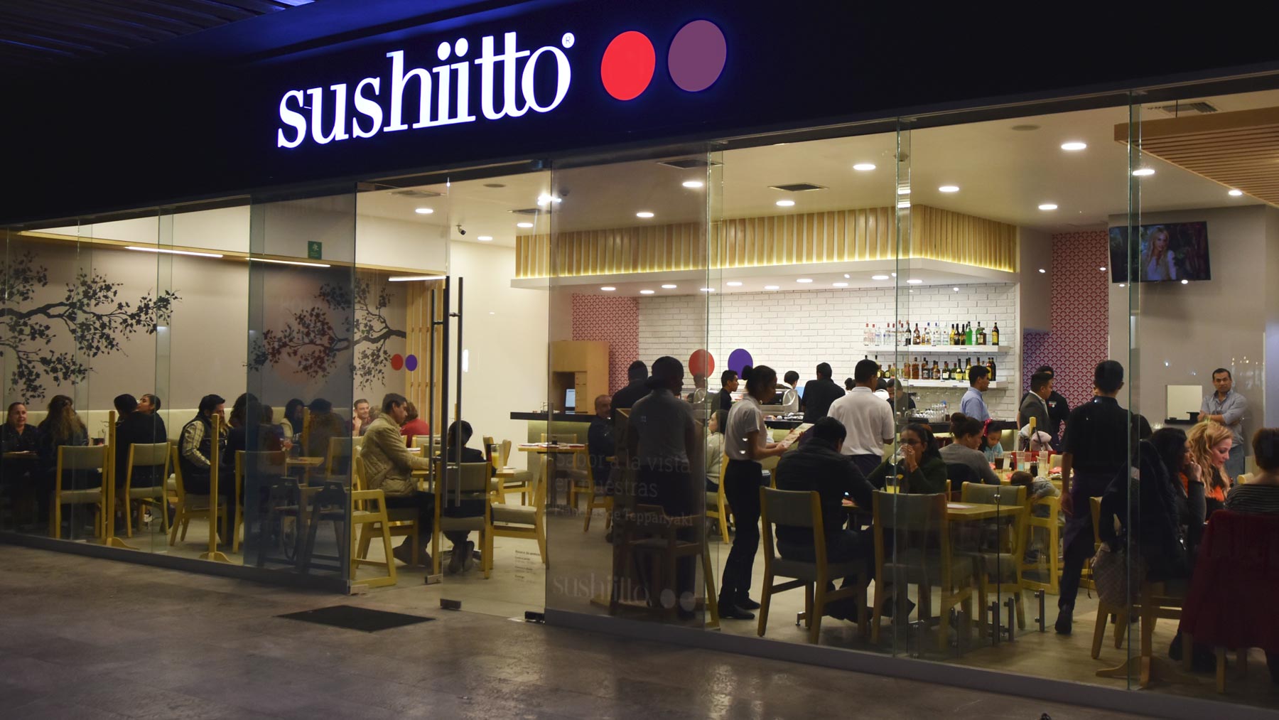
Sushi Itto is the chain of fast food restaurants pioneer in fusing Japanese cuisine with the taste and seasoning of Mexican and Central American cuisine. It is an emblematic brand, leader in its category, with more than 25 years of presence in Mexico and more than 150 branches. Sushi Itto’s brand needed to be renewed to attract young consumers but without changing the logo, because ita was weel-positioned after more than 25 years in the market, and changing it could cause confusion in the market.
Solution
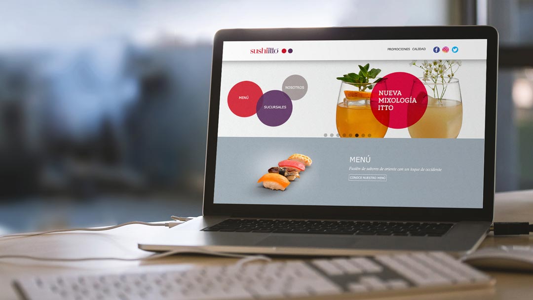
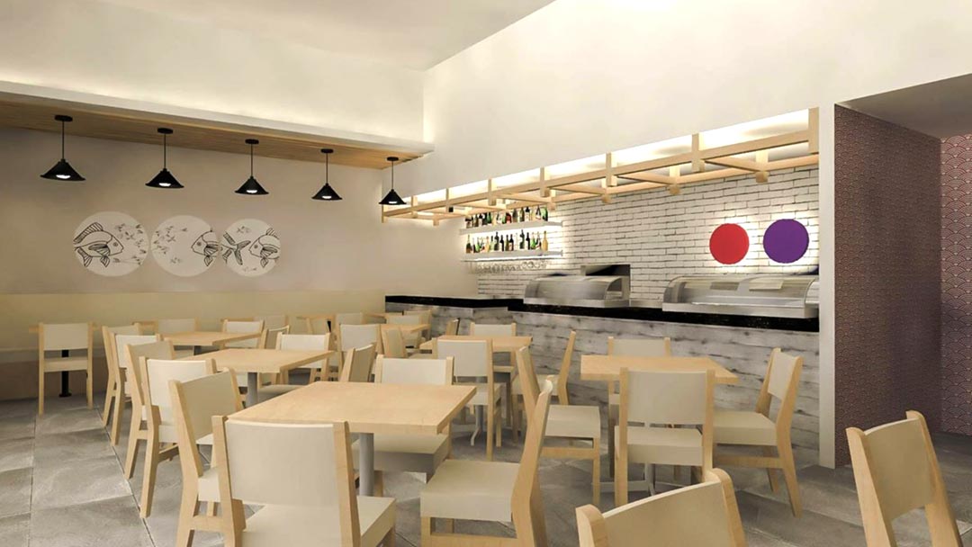
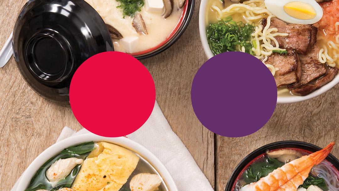
The solution involved reinterpreting the previous brand identity design: the two points, originated by the accents of the letters i and that symbolize the fusion of two cultures very different from each other: the Japanese and the Mexican; as well as the concept of ying and yang, the idea that every element on earth has its opposite. This created a new visual system based on red and purple dots, with white background, many freehand and organic elements; more in line with the aesthetics of the new generations. This also translated into a redesign of the interior design of the branches with white, light wood and the repetition of graphic patterns, subordinated to the brand’s red and purple points. This resulted is brighter and more spacious restaurants, still related to the brand, which attract new generations.
Related projects
See other projects
- Acesco
- ACP
- AGG
- Alianza
- Amarilo
- Antillana
- Aqura
- Argos
- Artisan
- Astron
- Axede
- Banco de Occidente
- Banco W
- Bancolombia
- BMC
- Breadco
- Brilla
- Casa Luker
- Casa Q
- CDMX
- Celsia
- CNCH
- Colcafé
- Corona
- Credivalores
- Dagusto
- Delecta
- Dicorp
- Doria
- Ecopetrol
- Emi
- Encantado
- Equidad
- Esencial
- Estelar
- ETB
- Exela
- Ezenza
- Fájate
- Fanalca
- Farinter
- Ficohsa
- Fundación Televisa
- Gobo
- Grival
- Grupo Argos
- Grupo Éxito
- Grupo Nutresa
- Grupo Orbis
- Grupo Progreso
- Herragro
- IziPay
- Juanfe
- La Cabaña
- La Joya
- La Santé
- Luker
- Mansfield
- Manuelita
- Maxo
- Meals
- MinDefensa
- Noel
- Odinsa
- Olv
- Oma
- Orux
- Ospinas
- Pintuco
- Piropo
- Porvenir
- Pronaca
- Proscenio
- Protección
- Qiip
- Ramo
- Sabi
- Sanofi
- Sol
- Solla
- Sonría
- Star
- Sumicol
- Sura
- Sushi Itto
- Tania
- TCC
- Team
- Tecnología
- Termoemcali
- Tuya
- Va y Ven
- Valórem
- Vanti
- Vardí
- Vid
- Welden
- Zenu
CLIENTS
APPROACH
PEOPLE
ABOUT
CONTACT
@2019 MARQAS INC. All rights reserved. Terms of use. Privacy policy.